A Look Back at My All-Time Favorite Alternate Ohio State Jerseys
When it comes to college football, few teams have been as synonymous with tradition, excellence, and iconic uniforms as the Ohio State Buckeyes. From their classic scarlet and gray to the signature silver helmets, the Buckeyes’ gear has become a staple in the sport. However, every now and then, Ohio State’s football team has worn alternate jerseys that push the boundaries of tradition while still paying homage to the team’s history and legacy. These alternate uniforms, though not always in regular rotation, have captured the imaginations of fans, stirred debates, and provided a refreshing change of pace for players and supporters alike.
In this article, I’m going to take you through my personal favorite alternate Ohio State jerseys that have graced the field over the years. While the Buckeyes are known for their traditional look, these alternates show just how creative the team can get without losing their identity. Each one of these jerseys tells its own story, whether it’s drawing inspiration from the team’s rich history, honoring legendary players, or celebrating the vibrant culture of Ohio State football.
1. The 2011 “Rivalry” Alternate Jerseys
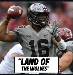
One of the first alternate uniforms that left a lasting impression on me was the 2011 “Rivalry” jersey, which was worn for Ohio State’s annual matchup with Michigan. These jerseys featured a unique mix of traditional and modern elements, showcasing a bold new design that stood out from the usual attire worn by the Buckeyes.
The helmets featured a matte gray finish, which was a departure from the usual high-gloss silver finish. It gave the helmets a sleek and modern look while maintaining the familiar shape and style of the iconic Buckeye helmet. The jersey itself was a nod to the team’s classic scarlet color, but with a twist. The numbers were rendered in a distinctive font that was different from the standard Ohio State style, and the shoulders featured a subtle camouflage pattern, paying tribute to the military and the sacrifices made by those who serve the country.
The 2011 “Rivalry” alternate jersey stood out not only because it was different from the typical look of Ohio State but also because it was tied directly to one of the most heated rivalries in college football. Wearing these jerseys in a game against Michigan, with both teams’ pride on the line, made this alternate uniform one for the history books.

2. The 2014 “Blackout” Alternate Uniforms
Fast forward to 2014, when Ohio State debuted their “Blackout” alternate uniforms. These jerseys were a radical departure from the traditional scarlet and gray, and it’s hard to forget the impact they had on the fanbase. The black jerseys were paired with black pants, and the team wore black helmets as well—an unexpected, but striking choice for a team whose colors have always been centered around scarlet and gray.
The 2014 blackout look was worn for a primetime game against Minnesota, and the response from fans was overwhelmingly positive. The jerseys featured bold black stripes down the side, with scarlet and white accents that added a pop of color and kept the Buckeyes’ identity intact. The helmet, in particular, drew a lot of attention. It featured a black version of the classic silver Buckeye leaf stickers, which, while not traditional, still paid homage to one of the most beloved aspects of Ohio State football history.
Despite the departure from tradition, the blackout uniforms were embraced by fans, and they became an instant fan favorite. The look was sleek, aggressive, and stood out on the field, and it felt like the Buckeyes were ready to take on the world with a new, bold persona.
3. The 2015 “Throwback” Uniforms
In 2015, Ohio State decided to pay tribute to its history with a “throwback” alternate uniform. This jersey was a nod to the past, bringing back elements of the Buckeyes’ uniforms from the 1960s. The design of the uniform was inspired by the one worn by the team during the legendary era of coach Woody Hayes, who led the Buckeyes to great success in the 1960s and 1970s.
The jerseys were a beautiful mix of vintage style and modern innovation. The most notable feature was the inclusion of the classic “block O” logo, which was emblazoned across the chest. This iconic symbol has been associated with Ohio State since the 1960s and has become a central part of the university’s identity.
Additionally, the jersey featured gray pants and a traditional white helmet, reminiscent of the uniforms worn by legendary players like Archie Griffin. The look was completed with scarlet accents, making this a classic yet refreshed alternate uniform. It wasn’t as daring as the blackout or the rivalry jerseys, but the 2015 throwback was an elegant way for Ohio State to honor its rich football history while still stepping outside the bounds of their typical design.
4. The 2017 “Championship” Alternate Jerseys
For the 2017 season, Ohio State rolled out an alternate uniform that was designed to commemorate the team’s 2014 College Football Playoff National Championship. The jersey featured a clean, modern design that maintained elements of Ohio State’s traditional look while adding a layer of symbolism to celebrate their championship glory.
The uniform featured a white jersey with scarlet and silver accents. The numbers were outlined in silver, and the helmet included a shiny metallic finish that reflected the team’s championship pedigree. It was subtle but carried a deeper meaning for Ohio State fans. The 2014 season had been one of the most memorable in the program’s history, and this alternate uniform allowed fans to relive that championship run while showcasing a fresh design.
Perhaps the most unique part of the 2017 alternate uniform was the use of the “national champions” patch on the shoulder, which further solidified the connection between the uniform and the team’s success on the field. It wasn’t as bold as some of the other alternate jerseys, but the 2017 “Championship” uniform was a fitting tribute to the Buckeyes’ title-winning team and served as a reminder of what Ohio State had accomplished on the national stage.
5. The 2018 “Block O” Jersey
In 2018, Ohio State released an alternate uniform that became one of the most iconic in recent memory. The “Block O” jersey was a tribute to the team’s iconic logo and the heritage it represents. The uniform featured a clean and simple design, with scarlet jerseys and black pants, allowing the block O logo to take center stage.
What made this uniform so special was how it blended tradition with modernity. The simple, bold Block O logo across the chest reminded fans of Ohio State’s deep-rooted connection to its past, while the sleek design of the rest of the uniform showed off a modern, more athletic feel. The silver helmets, with their familiar buckeye leaf decals, completed the look, providing a perfect balance between the old and the new.
This jersey was worn for a primetime game against Michigan, and it felt like a fitting choice for such a high-profile matchup. The “Block O” alternate was an instant classic, and it remains one of the most memorable alternate jerseys in Ohio State history.
Conclusion
Ohio State has a storied history when it comes to its football uniforms. Though the team is known for its classic look, the alternate jerseys they’ve worn over the years have brought new and exciting elements to the table. From honoring the military with camouflage designs to celebrating the team’s rich history with throwback looks, these alternate uniforms have allowed the Buckeyes to experiment while still staying true to their identity. Each jersey tells a story and reminds fans of the pride, tradition, and excellence that come with being a part of Ohio State football.
In the end, the best alternate jerseys aren’t necessarily the flashiest or most controversial—they’re the ones that resonate with fans, celebrate the team’s legacy, and make every game feel like a special occasion. Whether worn during historic rivalries or celebratory seasons, these alternate uniforms will always hold a special place in the hearts of Ohio State fans.


